Part of the “Making the Family Photo Wall” post series:
- Choosing Picture Frames
- Arranging Frames on the Wall
- Hanging Picture Frames
- Choosing & Arranging Photos
Admittedly, Jill handled this aspect, so I’ll just share my thoughts on what I think really made this work. This of course is a critical part that makes all of the other efforts worthwhile. In other words, get this part wrong, and the rest of it probably doesn’t matter.
Comparable Quality
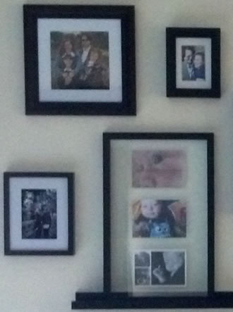
I think this is probably the most critical element. This doesn’t mean that all of your photos must be shot by a professional photographer (though it helps, especially if it was the same photographer for all, like our amazing photographer Oscar Pallares), but they should share a consistent level of quality. Quality, in this case, is as much about the framing and the “eye of the photographer” as it is the actual prints…ours are all printed right from an inkjet printer onto photo paper.
Story Balance
As I mentioned at the beginning, I didn’t necessarily want a “wedding wall.” Certainly, that can be done and it can look great, but we really wanted something that felt a little more timeless. However, I think the pendulum can swing way too far the other way as well. For us at least, we based most of the pictures around a few separate photo shoots…engagement photos, the wedding, and our fall/Christmas family photos, and then filled in with a few others, like Hazel and Hamilton’s birth announcements.
The specifics of this will really be dependent on your own taste as well as the pictures, frames, and overall arrangement you are constructing. If you already have all the pictures at the start of the project, this is where placing them on the FPO (for position only) templates would really come in handy.
One thing to experiment with would be whether you keep your individual stories grouped, or break them out amongst the frames. For us, we intermixed them all which I think helps to give it a varied look without over-powering your focus on any one particular area.
Visual Variety
Again, this may come down to personal tastes, but I think breaking things up with some more formal-looking pictures and with some more candid pictures gives it a little extra life and vibrancy. Additionally, intermixing a few black-and-white pictures with color gives the whole display another, deeper dimension.
In either case, a little bit goes a long way and it is probably best to avoid an even split, which starts to feel too planned and calculated…it becomes the “one size fits all,” which we know, generally doesn’t fit anyone well, but doesn’t not fit…meh.
In Your Face
Finally, and again this will be somewhat subjective for specific instances, but don’t be afraid to get up close and personal with the pictures. Forget the nicely centered school portrait look…crop in close, move off center, bring in an angle, etc. Hopefully, if you have professional photos to begin with, much of this may already be done for you. I think it helps to really identify what the key element is in each photo, and more times than not, it probably isn’t, so crop in from there and see what you get.
For example, is it the background or the person, and if it’s the person, is it the whole person or their head, and actually is it their head or their face, and most likely, it’s their eyes, perhaps. Again though, aim for a careful balance, breaking up a lot of close-ups with a few wider views may be best.
And there, if all comes together nicely, you hopefully are left with a wonderful family photo wall.
Cheers
Comments
One response to “Choosing and Arranging Photos”
We slowly chose, printed, temporary-taped onto the hung frames and then placed them in the frames over a period of a week or 2. Especially when you print them at home, there’s really nothing easier to change than a photo placement you don’t end up liking.