Part of the “Making the Family Photo Wall” post series:
- Choosing Picture Frames
- Arranging Frames on the Wall
- Hanging Picture Frames
- Choosing & Arranging Photos
Frames set the foundation on which the family photo wall would be built, and how well this was done would mean the difference between beauty and beast. It really is good to start from scratch and avoid the temptation of pulling into service the various frames you may already have around the house.
At the very least, I would recommend thinking through the look and feel you want to create before even picking up a frame. Then, if you happen to have frames that fit the bill, brilliant.
In general, it’s important to consider the characteristics of the frames…
- material
- color
- secondary color
- size
- shape
- texture
- style
- matting (style and color)
From there, just like mixing patterns when it comes to clothing, I’d suggest picking a base characteristic or two to build off of, and then carefully determining where you bring in variable characteristics. Remember that the photos will bring some contrast and variety on their own and of course, should ultimately be the focal point.
Less is definitely more here. At all costs, avoid the PowerPoint syndrome where you try to work in every possible transition, multiple fonts, and text treatments. Unless you are shooting for a completely, over-the-top look, and have the personality and decor to back it up. Otherwise, don’t feel that you have to vary every or even most of these characteristics. In fact, another way to think about this is, “the more noticeable the difference of a particular characteristic, the less noticeable the other characteristics should be.”
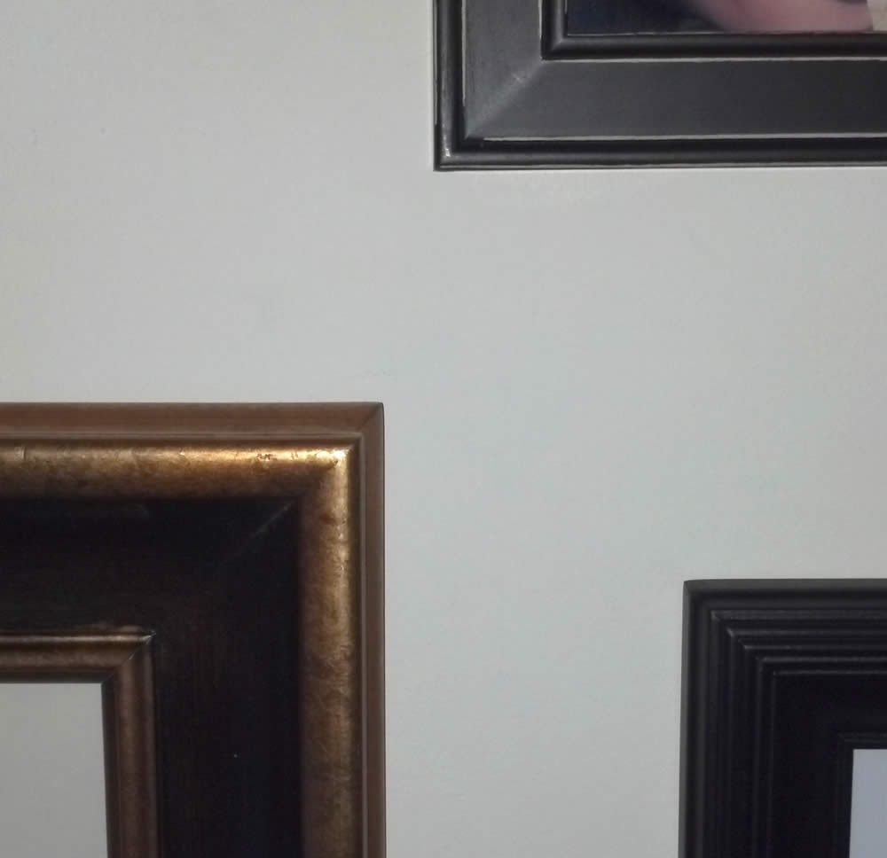
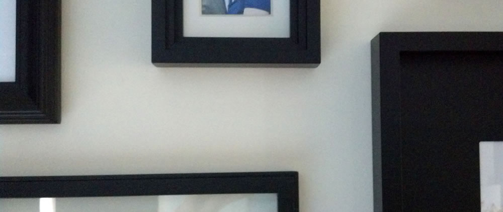
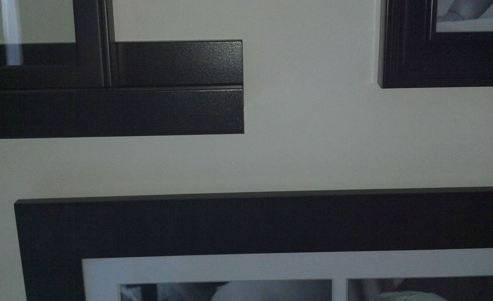
For us, we knew we wanted some variance in picture frame size and shape, texture, and photo sizes, as well as a mix of color and black & white photos. So to avoid creating a visual circus, we decided to go with black frames, primarily wood, with white mats. However, we also didn’t want the “kit look,” so rather than buying a purpose-made set of 10 matching frames, we set out to buy frames from different manufacturers and from different stores. While there was some variety in style, most were modern, flat styling. Only one frame had a subtle, secondary color, and one frame broke the mold and was a completely different color, which we used to create a unique focal point.
As in most things, the key to rules is figuring out precisely where to break them.
The only other suggestion I’d make here that may not be obvious is to avoid restricting yourself prematurely on the number of frames and then seeking out said number of frames. Not only will this be constraining, but most likely be frustrating as well as you agonize over the last two frames. Instead, buy to your heart’s content, hang on to the receipts, and be very careful with them until you figure out which ones you want to use and which ones should go back.
However…you may want to avoid buying more than you can reasonably afford, as we at least ended up using all that we bought!
Next came Arranging Frames on the Wall
Comments
One response to “Choosing Picture Frames”
Another suggestion: Buy on sale! We bought many of our frames at Kohls with their lovely 30% off coupon on top of already marked-down prices. I also stalked the clearance pages on my favorite decorator sites to find a couple.